Butter Yellow: The “It” Color of Summer 2025 Plus: How to Paint Match Your Wallpaper
Every season brings a standout shade. This year it is butter yellow. Soft, creamy, and quietly cheerful, this gentle yellow brightens a room without shouting. It feels nostalgic and fresh at the same time, which is why you will see it in fashion, ceramics, and home interiors across Canada.
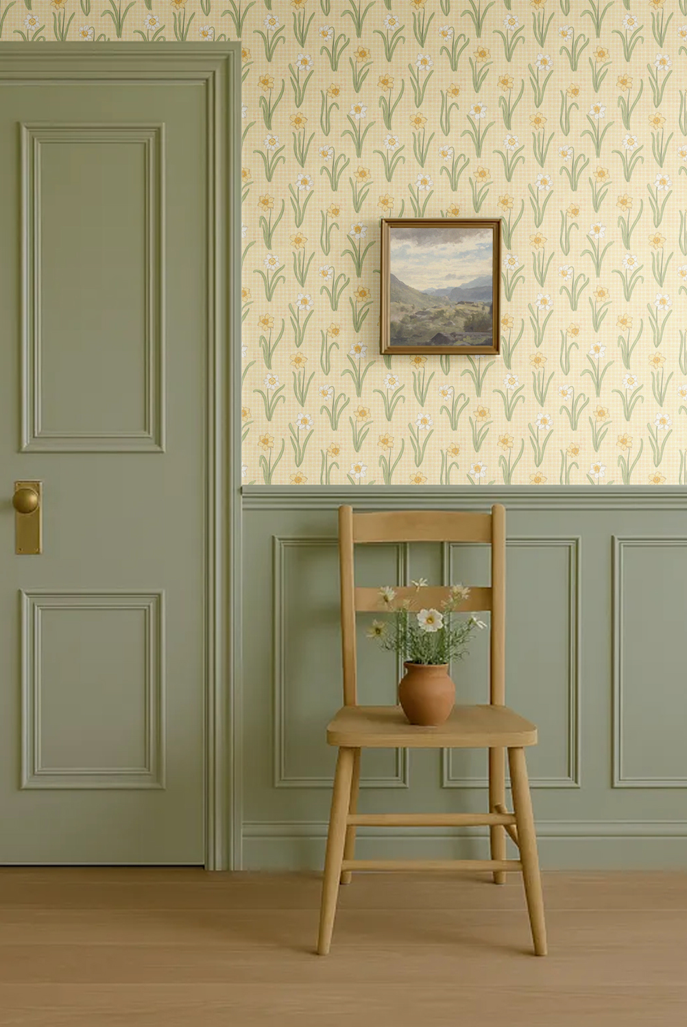
At Rocky Mountain Decals, we love Sunny Veranda by Sherwin-Williams as a true butter yellow. It delivers a warm glow that makes a space feel welcoming and lived in.

How butter yellow works with wallpaper
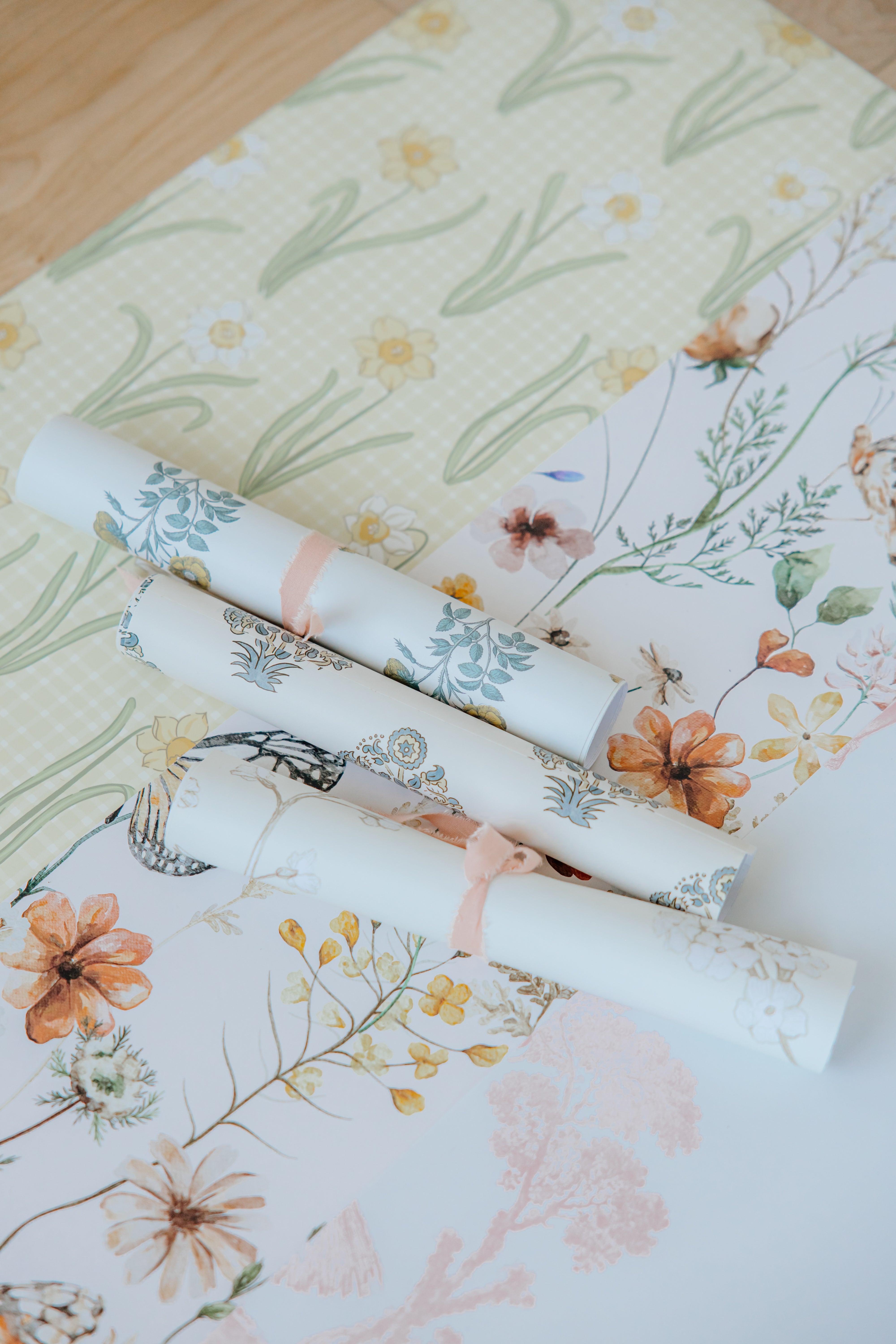
Butter yellow plays nicely with pattern. It complements florals, stripes, and vintage-inspired prints, adding warmth and depth while letting the artwork shine.
- With florals: Butter yellow pulls out soft greens and blush tones for a cottage-bloom feel.
- With stripes: It creates a timeless, French-inspired look that still feels modern.
- With bold motifs: It softens bright pinks in playful prints like our Coastal Cowgirl design, creating balance.
Mix all of these design styles to get our beautiful Primrose Wallpaper design!

Butter yellow in kitchens
In kitchens, butter yellow feels uplifting and fresh. It complements blush tile, warm woods, and colorful ceramics. Adding floral wallpaper on one wall makes the room feel cheerful without overwhelming the space.

Powder rooms that glow
Butter yellow is perfect for small spaces. Use it on wainscoting or cabinetry and pair with patterned wallpaper above. The color reflects light beautifully, making compact rooms feel bigger and brighter.

Nurseries filled with warmth
Butter yellow is naturally comforting, which makes it an excellent choice for nurseries. Paired with floral wallpaper, it creates a joyful yet soothing backdrop that grows with your child.

How to paint match your wallpaper
A great paint and wallpaper pairing makes a room feel intentional. Use this simple method to dial in a butter yellow that complements your print. (We used the same method when matching our Coastal Cowgirl Design!)
- Pick the role of the color. Decide if butter yellow is for walls, millwork, or a vanity. The role affects how saturated you should go.
- Pull the reference from the print. Hold your wallpaper sample up and identify the lightest yellow in the design. This is usually the safest wall color.
- Test in real light. Paint two swatches on white card and move them around the room. View in morning light, afternoon light, and evening light.
- Check sheen. Use eggshell or matte on walls for a velvety look. Choose satin or semi-gloss on trim and wainscoting.
- Confirm with a sample. Tape your painted card next to the wallpaper on the wall and live with it for a day before committing.
Designer tip: when in doubt, choose the slightly lighter swatch. It keeps the room airy and lets the pattern take centre stage.

Rooms that love butter yellow
- Kitchens: Butter yellow walls or a painted island paired with floral wallpaper and brass hardware.
- Powder rooms: Wallpaper above beadboard with the beadboard painted in a matching yellow.
- Nurseries and kids’ rooms: A cheerful backdrop that grows well with neutral furniture.
- Entries: Create a welcoming first impression with stripes or a floral runner pattern.
Plan your project
Ready to try the look in your home? Order a wallpaper sample, then use our calculator to confirm how many sheets you need. If you are pairing with paint, test a swatch right beside the sample before you commit.
Shop wallpaper | Use the wallpaper calculator | Watch application tutorials