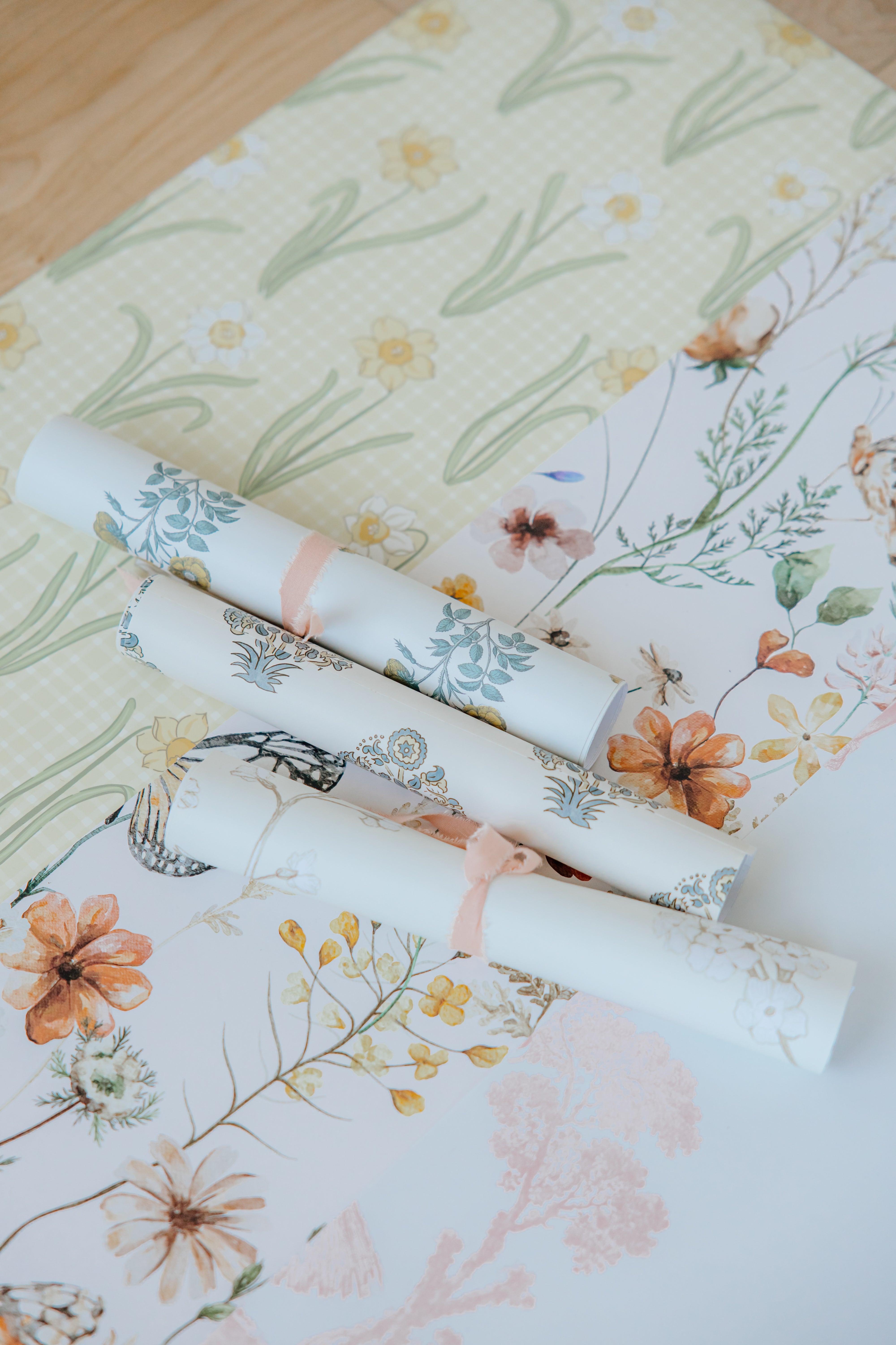
Paint Color of the Year 2026 announcements always spark inspiration, but knowing how to pair those trending shades with wallpaper is where the real magic happens. Below are five standout paint color pairings, styled with wallpaper designs that balance color, pattern, and warmth.
Many of our wallpapers are fully custom colorable, so if you are working with a specific paint shade or even Pantone’s 2026 Color of the Year, we can adjust the design to create a seamless match.
Sherwin-Williams Universal Khaki + Blue and Cream Plaid Wallpaper

Sherwin-Williams Universal Khaki is a soft, grounding neutral that works beautifully in family-friendly spaces. It has just enough warmth to feel cozy without leaning too beige.
Paired with our Blue and Cream Plaid wallpaper, the result feels classic and relaxed. The plaid adds visual interest while keeping the overall palette calm and timeless, making this combination especially well suited for playrooms, living rooms, or casual spaces that still want structure.
Why it works: Warm neutral paint plus a traditional pattern creates balance without feeling busy.
Behr Hidden Gem + Mallard Wallpaper

Behr Hidden Gem brings richness and depth, making it a strong choice for bathrooms, powder rooms, or accent walls.
Our Mallard wallpaper complements this paint color beautifully by introducing organic movement and subtle character. The pattern keeps the space feeling layered rather than heavy, especially when paired with classic fixtures and natural textures.
Why it works: Deep paint colors shine when paired with wallpaper that has soft contrast and natural motifs.
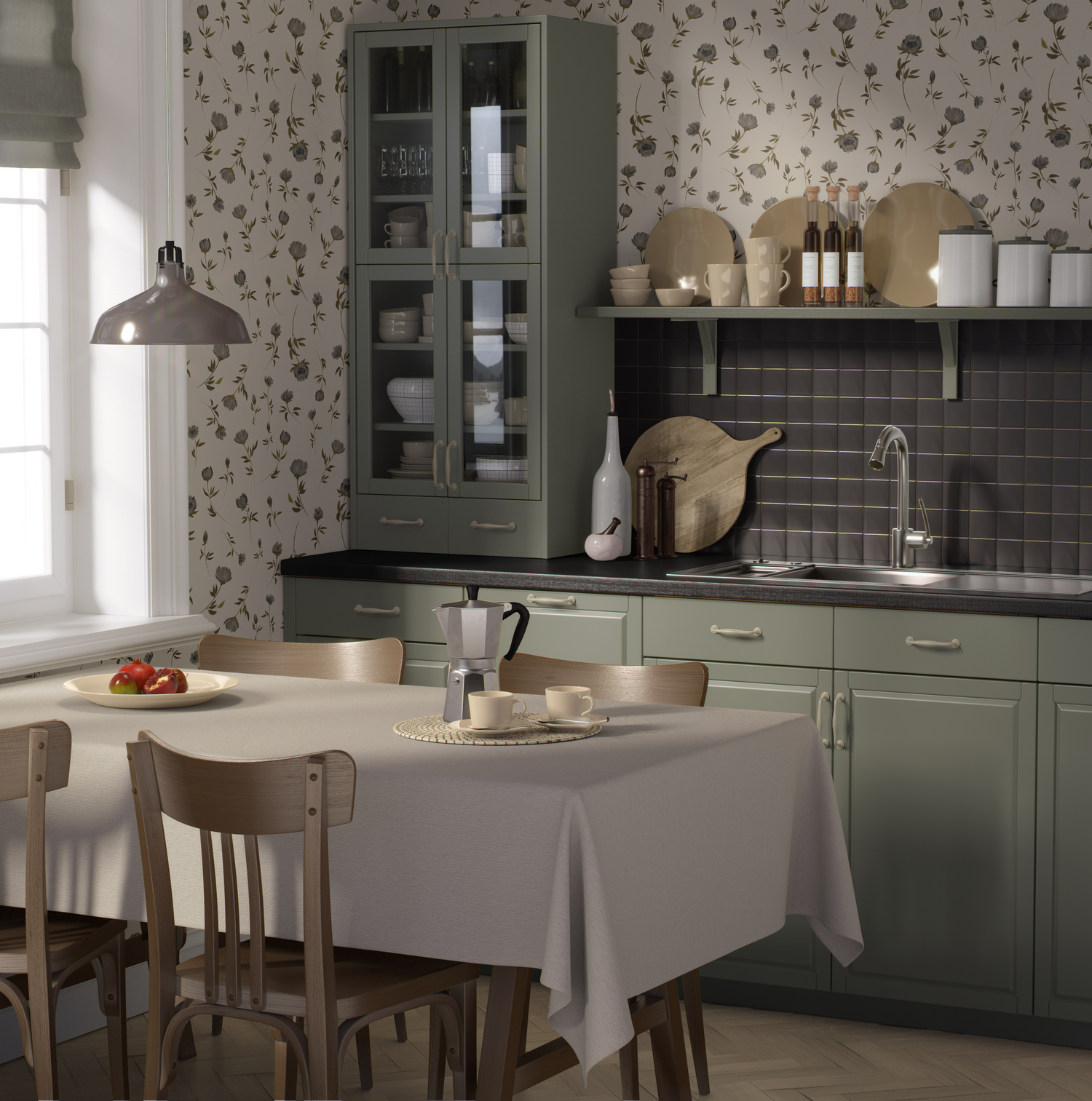
Valspar Warm Eucalyptus + Grace Floral

Valspar Warm Eucalyptus sits in that sweet spot between green and neutral, making it one of the most versatile paint shades of 2026.
Our Grace Floral wallpaper enhances that softness with a delicate floral pattern that feels calm and welcoming. This pairing works especially well in kitchens and dining spaces where warmth and approachability matter.
Why it works: Muted greens pair best with florals that feel airy rather than bold.
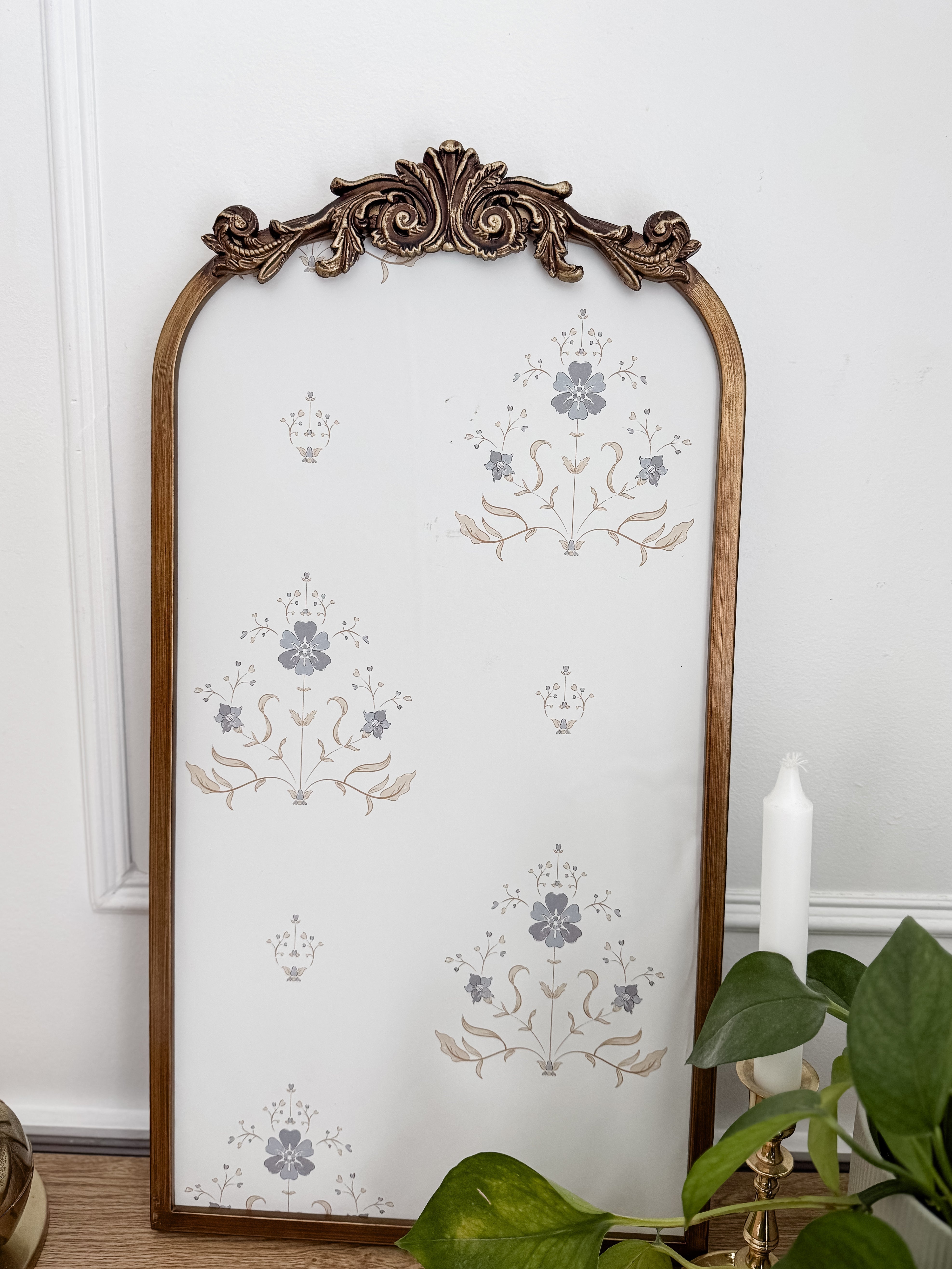
Glidden Warm Mahogany + Peony Wallpaper

Glidden Warm Mahogany brings richness and drama, but it needs a softer counterbalance to avoid feeling too dark.
Our color customized Peony wallpaper does exactly that. The floral design lightens the space while still complementing the warmth of the paint, creating a look that feels elegant rather than overpowering. This combination works beautifully in bathrooms and bedrooms.
Why it works: Bold paint feels more approachable when paired with a soft, detailed floral.
Benjamin Moore Silhouette + Marilla Yellow

Benjamin Moore Silhouette is a deep, moody neutral that adds instant sophistication to a space.
Pairing it with Marilla Yellow wallpaper introduces warmth and brightness, making this combination ideal for nurseries and children’s spaces. The yellow softens the darker paint while keeping the room cheerful and inviting.
Why it works: Dark paint becomes playful and welcoming when paired with a warm, light wallpaper.
Wallpaper Colors That Work With Any Paint or Design Vision
Many of our designs can be adjusted to coordinate beautifully with your chosen paint color, including Pantone’s Color of the Year, making it easy to create a space that feels cohesive and intentional.
Whether you are starting with paint or building your palette around wallpaper, we are always happy to help guide color choices so everything feels cohesive, intentional, and thoughtfully designed.