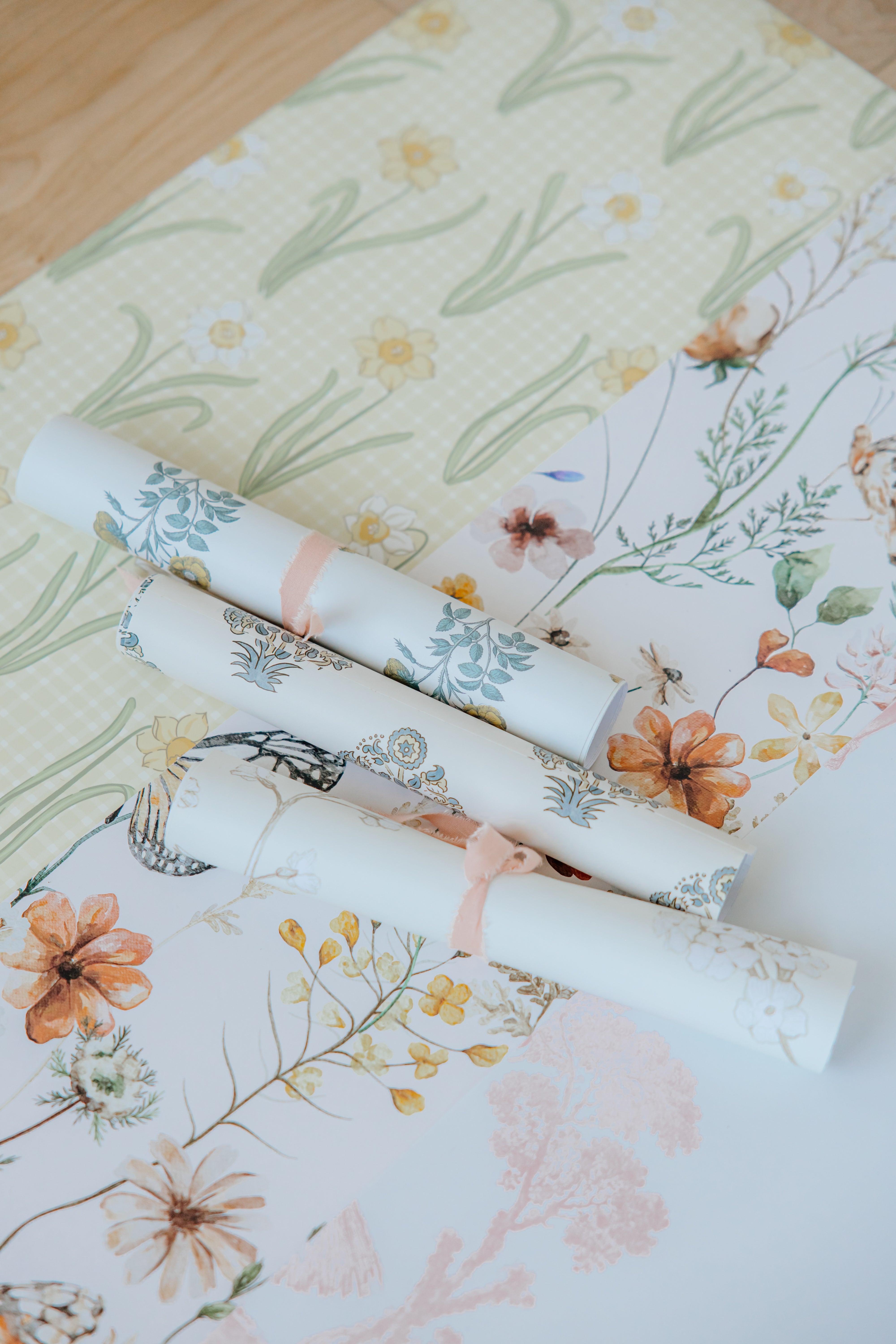
Our Madelyn Wallpaper is full of warmth, charm, and vintage-inspired florals that can instantly transform any room. It’s been a best seller for years, and we totally get why. But once you’ve fallen in love with this design, the next big question comes up: what paint color should you pair with it?
Picking the right paint is all about creating balance, whether you want your wallpaper to stand out as the star of the room or blend softly into a cozy, coordinated space. Here’s a simple guide to help you find your perfect match.

1. Study the Colors in the Wallpaper
Take a close look at Madelyn’s florals. You’ll see soft ivory, muted gold, warm mustard, rosy blush, earthy greens, and touches of coral and mauve. Each of these tones can inspire a wall color depending on the mood you want to create.
2. Decide on the Role of Your Wallpaper
Ask yourself: do you want Madelyn to be the focus, or to blend in?
For a bolder look, choose a color that complements one of the floral tones, like a muted mustard, dusty blush, or soft sage.
For a softer, timeless look, go with a neutral from the background, such as creamy ivory or warm beige. Both options let the pattern shine in their own way.
3. Choose Your Paint Family
Once you know your direction, narrow it down to a paint family. We love Sherwin Williams and Benjamin Moore for their timeless, easy-to-match tones.
- Neutrals: Cream, ivory, or light taupe for a calm backdrop.
- Greens: Soft sage or muted olive to echo the leaves.
- Warm tones: Mustard or terracotta for a cozy, vintage feel.
- Romantic shades: Blush, rose, or mauve to bring out the florals.

4. Test Paint Swatches in Your Space
Lighting can completely change how a color looks. Paint small patches beside your wallpaper sample and check them throughout the day. We always grab a few sample bottles from Home Depot, they’re around six dollars each, and any leftovers are perfect for craft projects. You can also take one of our wallpaper samples with you to have your own custom color made to match our wallpaper!
5. Balance the Room with Finishes and Decor
Before committing to a color, think about the rest of your space like your flooring, furniture, and accents. A creamy neutral lets you go bold with furniture and textiles, while a deeper shade can add warmth and depth. We love mixing textures, thrifted wood pieces from HomeSense or soft linens from Crate & Barrel always pair beautifully with Madelyn’s vintage charm.

6. Trust Your Gut
If a color makes you happy when you walk into the room, it’s the right one.
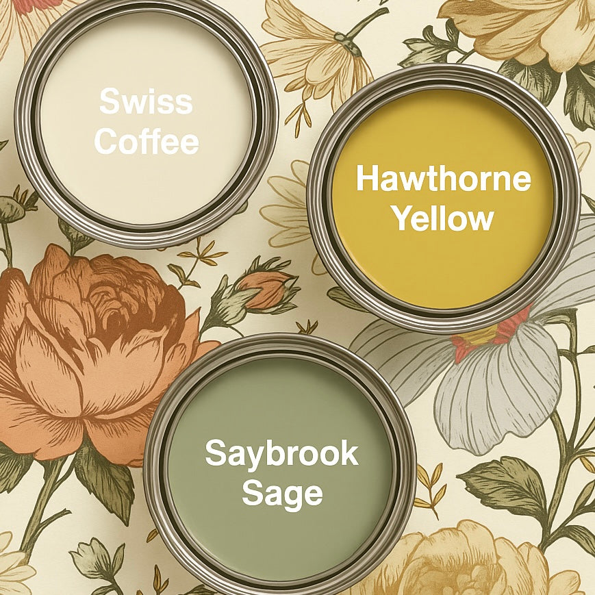
Paint Colors We Love with Madelyn
Here are a few shades that complement this design beautifully:
- Swiss Coffee – a soft ivory that blends perfectly with Madelyn’s base.
- Saybrook Sage – an earthy green that pulls from the foliage.
- Hawthorne Yellow – a rich, cheerful yellow that highlights the blooms.
- Malted Milk – a warm beige for a cozy, vintage-inspired feel.
- Terra Mauve – a soft, romantic mauve that echoes the pink tones in the design.

Always test your paints before committing. Even the perfect shade can look completely different once it’s on your wall. We’re always sharing color match ideas and room inspiration on Instagram, so be sure to check our reels for more pairing examples!